Beyond Compliance: Rethinking
Financial Limits
38%
reduction of CS contacs
7
usability problems fixed
Brief under regulatory pressure
In 2026, the UK Gambling Commission updated RTS 12B, the regulatory technical standard governing responsible gambling tools. The update required a new deposit limit type to be introduced: alongside the existing net deposit limit, users now had to be able to choose a gross deposit limit, or no limit at all.
The compliance deadline was 30 June 2026. The brief landed six weeks before that date. Missing it wasn't just a missed sprint — it meant exposing the platform to non-compliance findings, licensing risk, and reputational damage tied directly to responsible gambling failures.
The PM's initial ask reflected that urgency: treat this as a compliance patch. Add the new limit type behind a toggle, confirm changes with a modal, ship before the deadline.
Discovery: why I had to push back
I instantly noticed the Financial limits tool was an already confusing experience. Financial limits, at the moment, allowed users to add several timeframe limits (Daily, weekly and monthly). With the new regulation requiring us to add 1 more level of content — deposit type, ‘Gross’ or ‘Net’— the experience would become even more confusing to users.
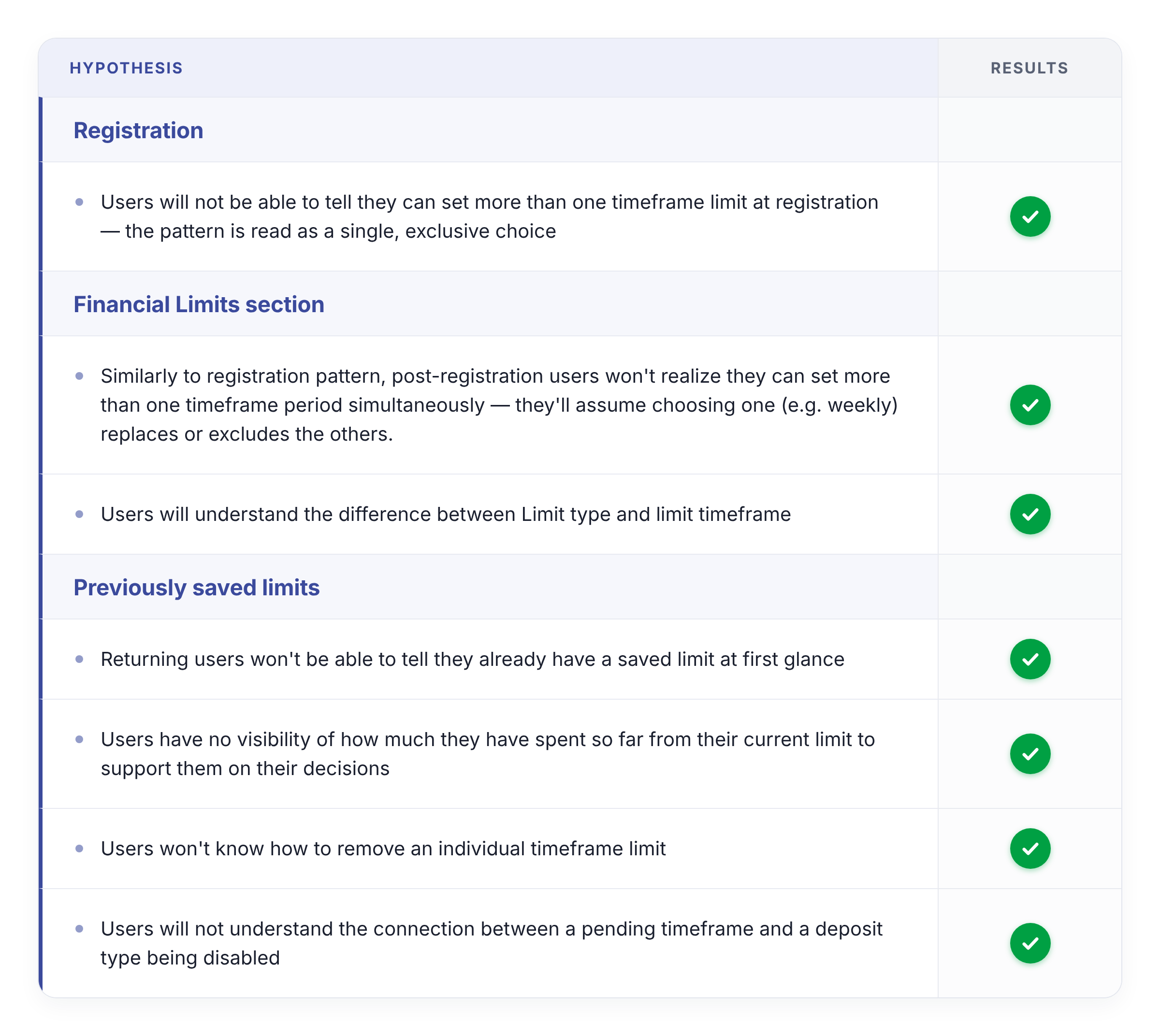
From a UX perspective, it looked like we had to fix the base experience first to ensure users could use the tool properly. To confirm my hypothesis, I added the requirement to the deposit limit tool as it stood on production, and run usability tests to identify the problems with the experience.
All seven hypotheses were confirmed — including one that mattered for a different reason: users correctly told limit type and limit timeframe apart. That result ruled out an easy explanation. The problems we found weren't confusion caused by adding a new choice — they were already there, in the base experience, before RTS 12B introduced anything new.
A compliant dropdown on top of a broken tool doesn't produce a compliant experience. It produces a broken tool that's technically compliant. If the base tool already fails at enabling users to use the feature efficiently, the compliance feature can't do its protective job — no matter how well-designed the new dropdown is.
Before the regulation
How the old experience worked
At registration, users chose between setting a net deposit limit or no limit at all. Post-registration, they'd go into the Deposit Limits section — either to set a limit for the first time, or to edit the limit they'd saved during registration.
What "just adding it" would have looked like
The initial ask was to drop a switch between "Net Deposit Limit" and "Gross Deposit Limit" into the existing flow, confirmed with a modal, shipped before the deadline. Below is that flow as it stood, with the new deposit-type dropdown pasted in.
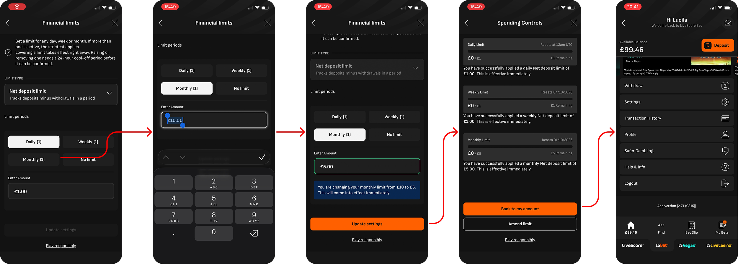
Representation of old experience with new regulatory requirements.
Used on usability tests to confirm my hypothesis that the experience was effectively broken
Below, I walk through each problem this experience surfaced during usability tests, and how I resolved it

Problem 1 — Users cannot tell they can set more than one timeframe limit
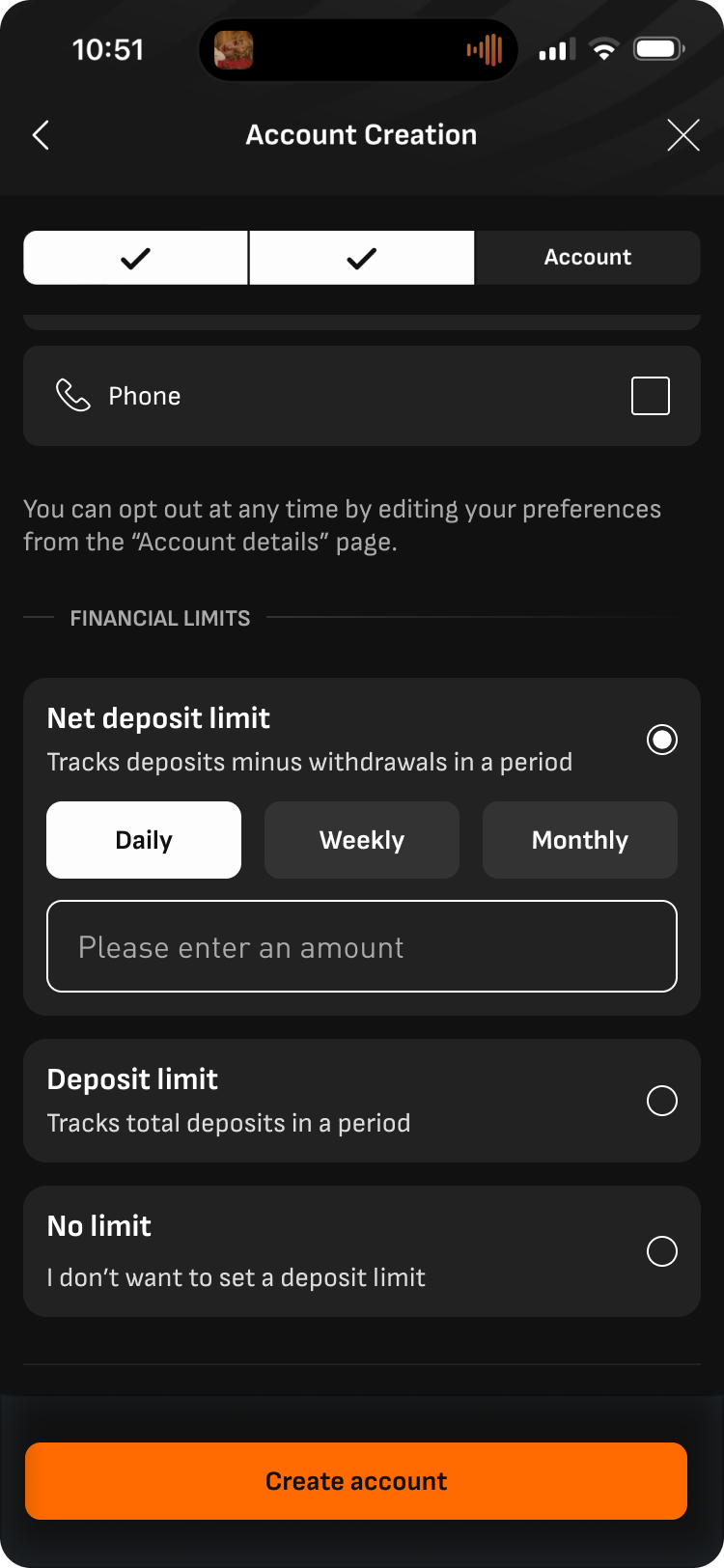
Solution
Registration now makes it explicit that a user can add more than one limit once they've finished setting the first — surfaced through an "Add more limits" action rather than a single exclusive choice.
Validated in testingThe pattern users on both registration and post-resgistration for the Financial Limits section, reads as an exclusive choice — pick one timeframe — when in fact users can set daily, weekly, and monthly limits simultaneously.
Problems 2 & 3 — No visibility of saved limits nor remaining allowance
Solution
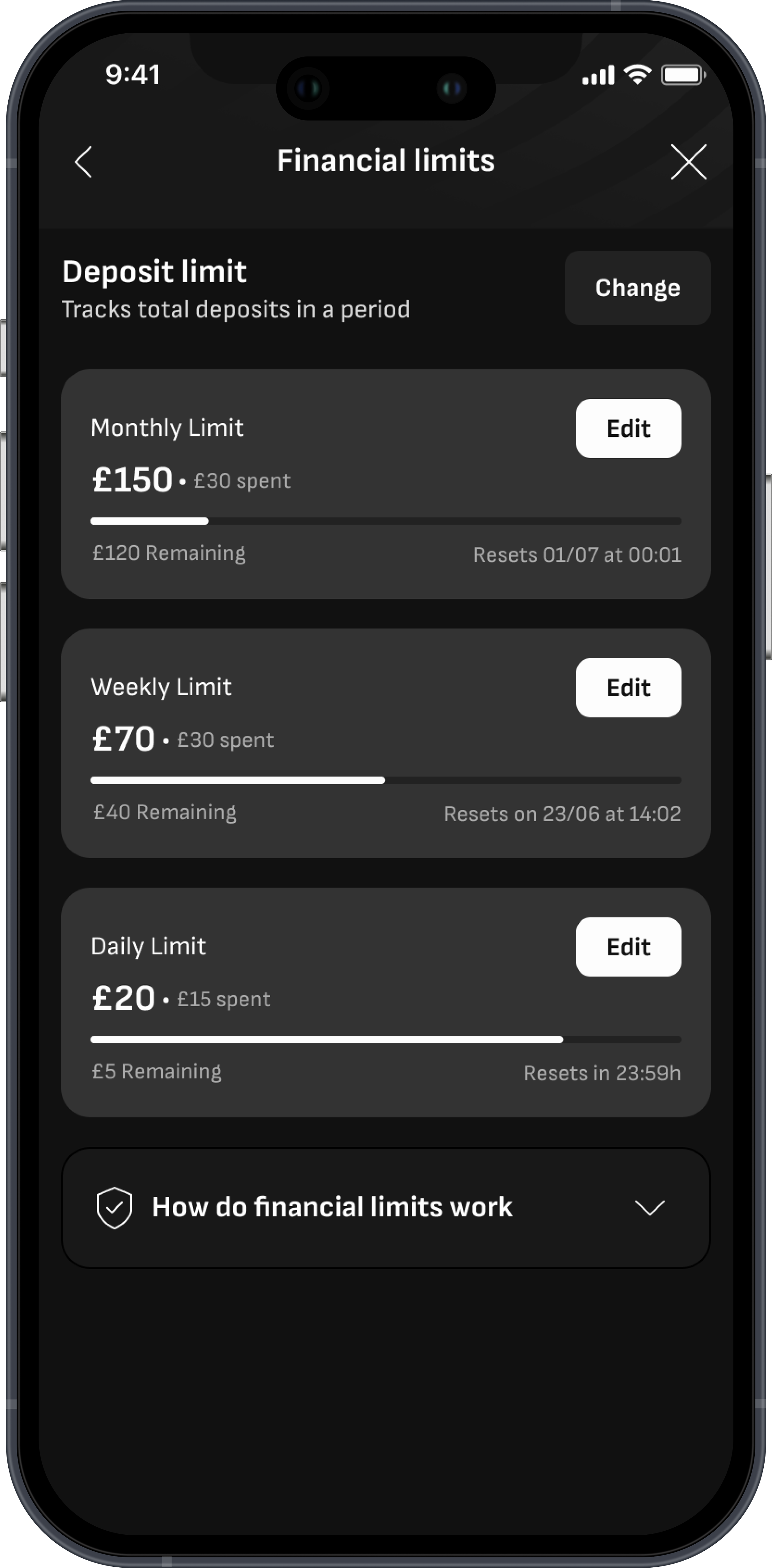
Saved limits, amount spent, and remaining allowance are now all visible on the same screen, enabling users to take informed decisions by providing the necessary information at the right time on the journey.
Validated in testing. With the old pattern, user had to tap into a limit to see what they'd previously saved, and remaining allowance only appeared after they'd already made a decision about a new limit — not before, when it would actually inform that decision.
Problem 4 — Hierarchical confusion: ‘No Limit’ sits at the same level as timeframes
Solution
Confusion is now reduced by showing ‘No Limit’ at the right hierarchal level — together with the other financial type options (Gross deposit limits and Net deposit limit).
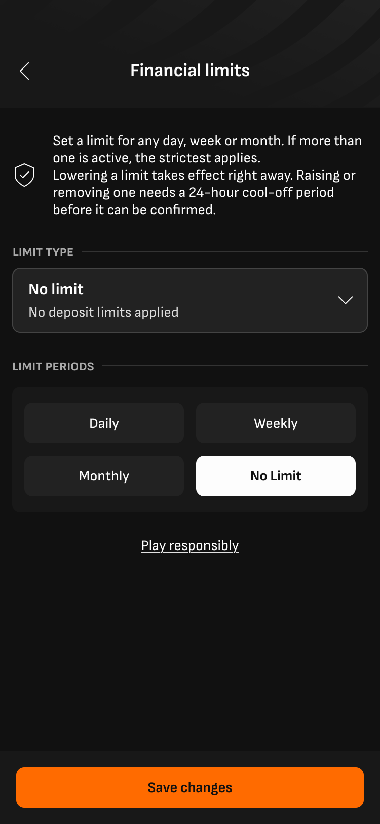
This wasn't something surfaced in testing — it's a foundational information architecture issue. "No Limit" sat visually alongside Daily, Weekly, and Monthly, when structurally it's a parent-level decision: choosing "No Limit" excludes timeframe choices entirely, while Daily/Weekly/Monthly only make sense once a deposit type has been chosen.
Problem 5 — No intuitive way to remove an individual limit
Solution
Users can now intuitively remove individual limits from the editing screen. The process takes 24hrs of cool-off mandatory period, so the interface clearly shows this to users before nad after takign the action.
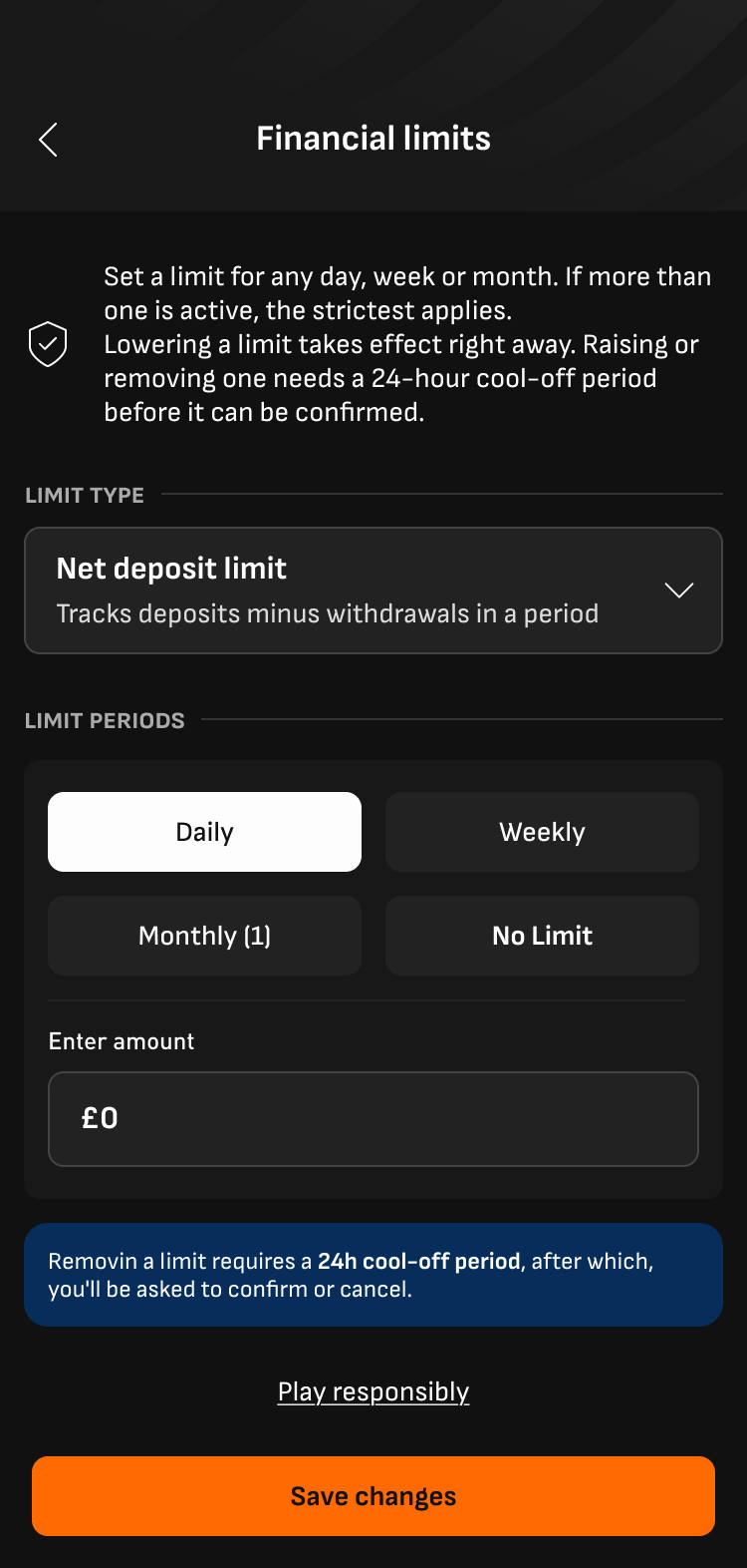
The only way to remove a limit was to manually type "0" into the amount field — which, from what we saw when testing it, was not a intuitive behaviour.
Problem 6 — No clarity on pending limits
Solution
Pending changes are now surfaced on the main Financial Limits screen, across every timeframe, enabling users to understand their financial limits state at a glance.
Any increase to a limit triggers a 24-hour cool-off period, during which the old limit still applies until the user actively confirms the change. In the old experience, a pending change was easy to miss — buried behind whichever timeframe tab the user happened to land on, with no way to see more than one pending change at a time.
Problem 7: A logic gap found
Solution
Align logic within these 2 use cases, providing a more consistent experience. If a new limit is inconsistent with a pending limit, the system will not allow it to go through, providing the user context of which limits are conflicting.
There was an inconsistency on treating incompatible limits. Whilst an incompatible limit was not allowed with current limits, the system will allow users to set up a new limit that was incompatible with a pending limit.
Scope negotiation
After the discovery and ideation phase, I discussed feasibility with the tech team. The high-level estimate was positive — there was time to expand scope, as long as backend logic didn't change.
With that, I brought the case to the PM and stakeholders: user research, technical feasibility, and design solutions together, arguing for a broader scope than the original patch.
Compliance stakeholders raised concerns about the risk that additional scope posed to the regulatory deadline. The PM asked for a more detailed technical breakdown before committing.
That detailed analysis showed the timeline was, in fact, too tight for the full redesign. The reason of these timeline concerns lied on concerns around how the back office systems interacted with each other.
We agreed with the PM and stakeholders to ship the minimum required for compliance in the first iteration, and prioritize the broader UX improvements as a standalone initiative for Q3.
Outcomes
38%
reduction of CS contacs
Customer support data shows a significant drop in the percentage of CS calls related to Deposit Limits, tracked against the current baseline.
7
usability problems fixed
The experience and usability was drastically improved, transforming a broken tool into a functional one, and transforming a fragmented experience into an intuitive one.
What I'd do differently next time
Regulatory work taught me to separate two questions that often get collapsed under a deadline: what must ship to comply, and what should ship to actually solve the problem. Holding that distinction — and being explicit about it with stakeholders — is now part of how I scope any compliance-adjacent project.